A couple of months ago I presented at the Big Data Innovation Summit in San Francisco along with Scott Sorensen, CTO at Ancestry.com . There we got a chance to talk about some of the ways Ancestry.com is handling big data.
In the Data Science team we spend a lot of time working with raw data. Ancestry.com has a lot of various data sources including user generated data and scanned digitized historical document collections. Users, while building their family trees, create their ancestor’s profiles (nodes in the family tree) and fill them with as much relevant information as they can: names, places and dates of birth, spouses, children, life events etc. Ancestry.com has more than 5 billion of those profiles.
By having all this data in one place we can start looking at the “big picture” – global historical events and processes that took place centuries ago. This helps us understand and provide the context of the records for our customers. With all the raw data we have, one way we can understand the context is by searching for patterns and correlations in historical document collections and family trees and try answering interesting historical and economic questions. (Note, that we are only using “public trees” when mining this data. There is an option for a user to mark his family tree “private” and then it will not be available to anybody else, but the owner)
Recently, we decided to look into history of immigration to the US. For simplicity, we called immigrants those people who were born elsewhere in the world and died in the US. So we ran some aggregation analysis (Hadoop, Hive) and computed total number of people (profiles in the family tree), who were born in any country in the world and died in US starting 1500. We counted around 15 million profiles that contain all the required fields and satisfy the above constraints. We bucketed these profiles by decades and here is the picture we got. The stacked plot shows number of immigrants from top 15 countries for the last 500 years. One could easily see two waves of immigration, the first one significantly dominated by British, with Germans and Dutch joining later on. It is also interesting to notice large numbers of Canadian immigrants. Though not well documented in immigration records, a large number of immigrants in 19th century came to the United States via Canada. Those immigrants were also originally from Britain, Scandinavia, and Northern Europe.
It is important to remember, that the data we use is user generated and, though, people typically do not have incentives to record wrong information about their ancestors into profiles, the data is not verified and can easily contain factual mistakes. There is also exists significant duplication of profiles going back in time, simply because different people create profiles for the same ancestors. Though we performed de-duplication of identical profiles, one still should be very careful using absolute numbers of immigration. At the same time, we think that the aggregated data still preserves general trends. It is also interesting to realize that the official historical immigration records are not available for that early US history and thus aggregated user generated data could become a unique source for such research.
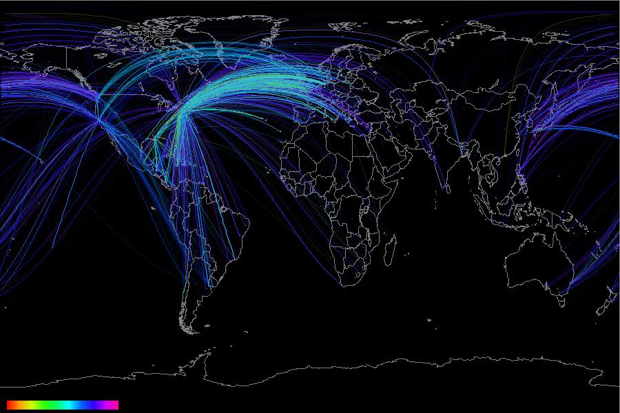
The next picture is the actual immigration map. We connected with lines places of birth and death of the immigrants. This visualization is done using less than 1% of the available profiles on Ancestry.com. We used stratified sampling, preliminary grouping by country and decade of birth. The lines are color coded from red to purple based on the person’s birth date. The majority of the immigration we observe happened in mid 19th century and thus most of the lines have blue-purplish color. One can also notice that early immigration was from England to the east coast in the US, while later from northern and western Europe to the mid-country and west coast of the US.

For comparison, we looked at historical records of people arriving to the US. Ancestry.com has multiple collections containing passenger arrival records (1820s ship captains were required to submit passenger lists) that contain passenger name, port of departure and arrival and arrival date. We used the same visualization methods to look at these records. Here we are more comfortable with actual numbers, since they are coming from official records. As expected most of the arrivals were happening to New York.

As you can see, there are many interesting things data scientists get to look at and uncover when getting access to billions of records and millions of family trees. With so many ways to slice the data, the possibilities are endless for the information we can discover and the historical context we can provide our customers.
